Inovista AB
Brand visual identity and website (ongoing)
Brand visual identity, website, copywriting and initial marketing strategy for an up-and-coming consultancy firm, specialized in helping companies with VSME reporting and workplace ethics education.
Visual identity
my design process
A visual identity for a brand is not just a logo, or colors, or typography. It is the sum of all these parts and more, which is a greater whole. This is what communicates a brand’s vision with their unique personality, and over repeated consumer exposure creates a brand’s image.
I follow roughly the same process for every brand, which is slightly different and more flexible than the standard design process.
My process for Inovista was as follows:
1. After a first meeting with the company CEO, I gained a firm grasp of the company’s vision and mission, their audience, unique value proposition, and preferred positioning, voice, and personality.
2. I summarized the results and turned them into a brief, which would direct all design steps; from assembling a mood board to analyzing competitor websites and drawing inspiration from other UI designers on the web.
3. The choices of brand aesthetics are not random. They should not be based on the personal tastes of internal stakeholders either.
In an effective system, these choices are based on the psychology of buyer decision-making. As a general rule, the aesthetics of a brand must create the perception having reached the solution to the consumer’s ideal outcome.
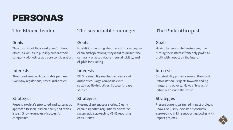
Based on the information I already had from the business, I created three personas to whom the brand channels and aesthetics would try to appeal. I skipped the bells and whistles of conventional personas such as names, demographic labels, and interests due to the time constraints. Moreover, my client, having been a sales expert with over a decade of experience, immediately got an idea of demographic ranges based on each persona.
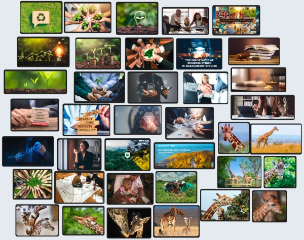
4. Based on the brief and personas and due to time constraints, I put together a mini mood board which aligned with company vision and mission, and included key desired elements, like the animal giraffe.
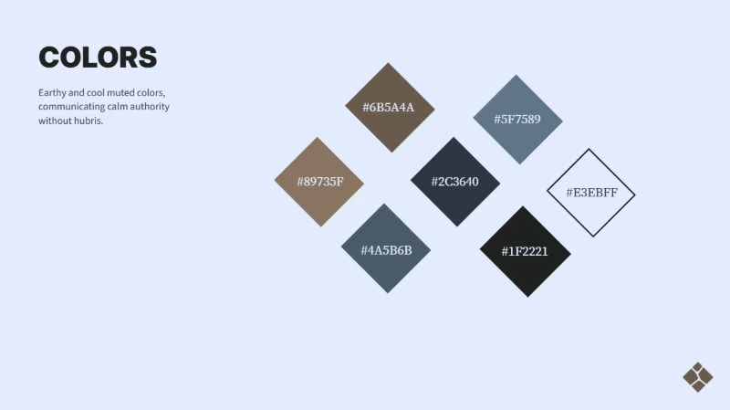
5. After approval I entered the mood board as a reference in a conversation with my AI agent dedicated to Inovista’s brand, and derived a primary color for the new visual identity. This color would be used in certain key elements throughout the new user interface, after a few modifications.
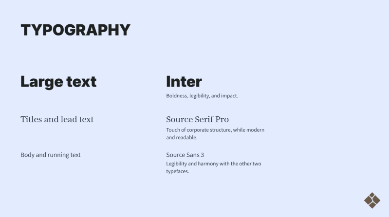
6. Typography can make or break the experience of a website, affect conversion rates, and accessibility. I carefully studied state-of-the-art as well as competitor websites, arriving at a suitable set of Font families.
Logo design process
There are many different approaches to logo design. For example, a designer can start from a filled form which they would earlier give the client, or brainstorm on concepts discussed in initial meetings with stakeholders.
The logo design for Inovista had to be done quickly since the business already had customers and was only waiting for a logo in order to set up a LinkedIn page and website; a source of truth for all business information and activities.
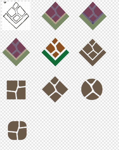
During my initial meeting with the client, they expressed the desire that the logo communicate innovation, their unique skill of creating connections between businesses, and a special liking to the animal giraffe.
As my initial sketch was done without having taken the giraffe requirement into account, instead of creating designs and asking for feedback right away, I first presented the client with multiple shapes and styles and asked them which one resonated with their idea of their brand and vision the most. I then took the most prominent visual feature of the animal giraffe, the body pattern, integrated it inside the shape and after iterations on the sketch and importing it into Affinity designer, created multiple versions of my logo suggestion to present to the client.
Website development
My vision for Inovista’s website was a clean, authoritative aesthetic that promised leadership and demanded attention.
I opted for an unorthodox asymmetrical floating menu, which would be balanced inside the browser screen by the weight of the left-aligned content of the pages. On mobile devices, the navigation would move to the bottom of the display for easier reach.
As the client needed this website quickly and I develop websites inside Elementor, a visual page builder, after creating a sitemap and sketching the wireframes for essential pages, I skipped prototyping in Figma and immediately started development.
The result was a classic yet modern interface which at every step directs visitors to the primary purpose of the website: booking the first meeting with Inovista.
Future work
The Inovista website is currently only an MVP: a Minimum Viable Product aimed at communicating essential business information and providing a way to contact the business.
Future work on the brand includes creating more graphical assets such as patterns, documents and stationery like invoice templates and business cards, customizing the marketing funnel for Inovista and creating a social media content strategy.
These steps will be carried out in the coming weeks, and this page will be updated with each completed step.
The tools I used during my work
I have recently moved from the Adobe creative suite to Affinity studio. I use Affinity studio for all of my design work; from vector and illustrations, to photo editing and manipulation, to layout design for digital and print.
I use Canva for quick collaboration and presentation, as well as for creating static social media and AI content.
As my client already had a WordPress hosting service and was familiar with the platform, Inovista has been built on WordPress, using the Elementor visual builder. I used custom CSS rules to achieve the frosted glass effects on elements throughout the website.