H2Health
Full brand, website, content, product design (ongoing)
Brand visual identity, website, online shop, product labels and mockups, and AI content for an in-house producer of dietary supplements in Sweden.
The work for H2Health started as a simple request to add an e-commerce section to their existing WordPress website. After inspecting the existing platform and realizing its limitations due to outdated development practices I offered to re-create the entire brand experience and website, in addition to creating the new online shop.
Visual identity
my design process
A visual identity for a brand is not just a logo, or colors, or typography. It is the sum of all these parts and more, which is a greater whole. This is what communicates a brand’s vision with their unique personality, and over repeated consumer exposure creates a brand’s image.
I follow roughly the same process for every brand, which is slightly different and more flexible than the standard design process.
My process for H2Health was as follows:
1. After a first meeting with company stakeholders, I gained a firm grasp of the company’s vision and mission, their audience, unique value proposition, and preferred positioning, voice, and personality.
2. I summarized the results and turned them into a brief, which would direct all design steps; from assembling a mood board to analyzing competitor websites and drawing inspiration from other UI designers on the web.
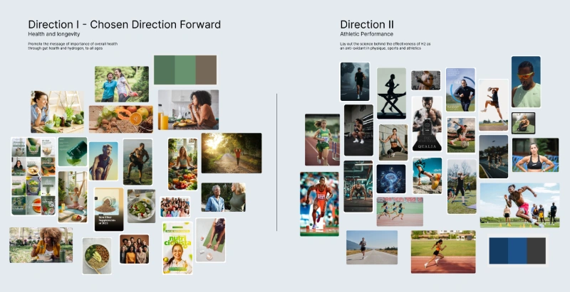
3.Based on the brief, I created two mood boards with two different messaging directions and brand positioning strategies.
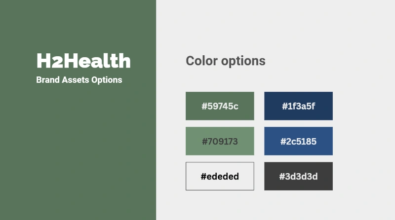
4. After approval I entered the chosen mood board as a reference in a conversation with my AI agent dedicated to H2Health’s brand, and derived a primary color for the new visual identity. This color would be used in certain key elements throughout the new user interface, after a few modifications.
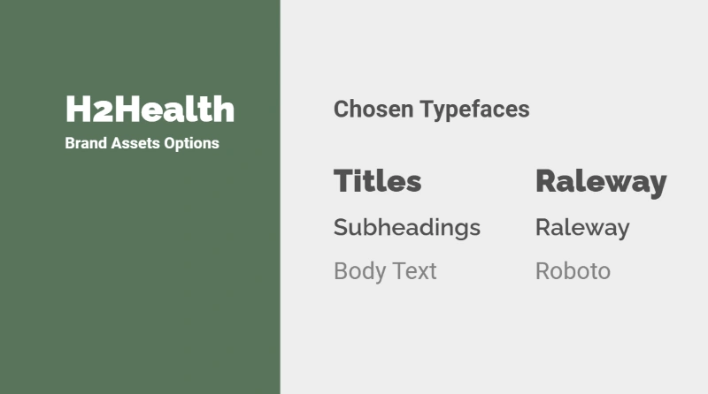
5. Typography can make or break the experience of a website, affect conversion rates, and accessibility. The combination of the two selected typefaces offers legible and modern font pairings throughout the brand channels.
Website development
H2Health’s positioning and their target market necessitates paying more attention to readability and easy of navigation throughout the website.
The combination of muted colors and warm tones with the minimal sans-serif font, complete with ample layout spacing and subtle animations make for the experience of reading a digital newspaper.
The navigation menu is using a hamburger button by default on all pages, ensuring a clean view and distract-free reading and purchase experience. The options on the navigation menu are large and descriptive, making them easier to find and select on any device.
Logo design process
There are many different approaches to logo design. For example, a designer can start from a filled form which they would earlier give the client, or brainstorm on concepts discussed in initial meetings with stakeholders.
During meeting with company stakeholders, it was requested that the logo resemble a person running towards the camera in perspective view. After taking inspiration of online illustrations of runners with a similar posture and opting for a stylized and minimal approach, I drew an initial sketch on the iPad, moving it over to Affinity studio for tracing.
I tested the uniqueness of the logomark by entering it in the WIPO global brand database and searching for similar-looking logos by concept and shape.
Upon further simplification I created vector logos and symbols for use across several brand channels.
Packaging label design
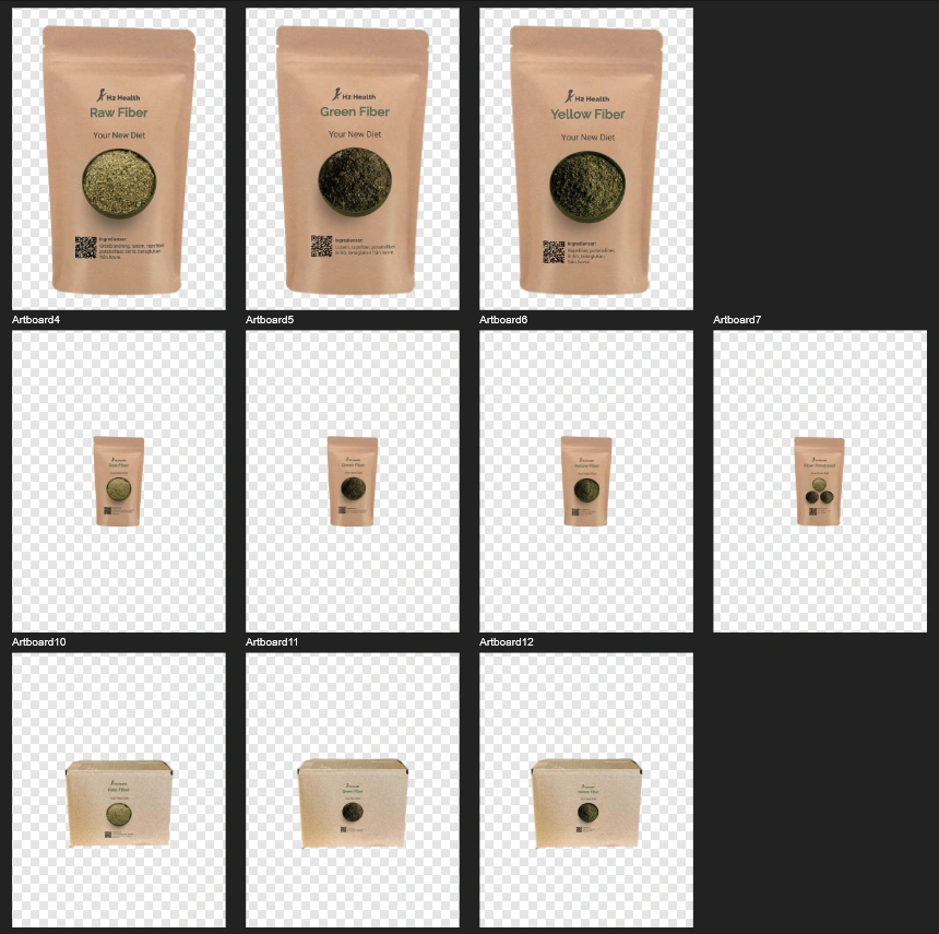
For physical delivery, H2Health had already ordered paper bags that would contain their primary product.
My responsibility was to create designs that would be printed on sticker labels to later be put on the paper bags. I needed to ensure consistency across the different labels, and a background color as close to the color of the packaging as possible.
I was supplied with only one photo of each type of product. Taking the photos inside a generative AI platform, I used them as one of the two input reference images and entered the picture of a bowl used in another section of the website as a second reference image. This allowed me to create a consistent display with the same lighting and from the exact same angle for all products.
The final composition was done inside Affinity studio. In addition to product labels, I created mockups to be used within the online shop and inside product pages.
Future work
With the core features of the H2Health website complete, it is now time to apply copywriting and SEO best practices to the pages.
H2Health also needs social media channels and a digital marketing strategy as well as some starting content.
The work will be supplemented and further polished in the coming weeks. This page will be updated to reflect each new delivery and change to the project.
The tools I used during my work
I have recently moved from the Adobe creative suite to Affinity studio. I use Affinity studio for all of my design work; from vector and illustrations, to photo editing and manipulation, to layout design for digital and print.
I use Canva for quick collaboration and presentation, as well as for creating static social media and AI content.
As my client already had a WordPress website and was familiar with the platform, the new H2Health website was built on WordPress, using the Elementor visual builder.